Dynamic Card Interface
Cloe-UI offers the possibility to add a customized card (an HMI component, so to speak) for each controller. The elements of the component have to be specified and served in the JSON format. It is possible to add input and output elements, such as buttons, linecharts, and simple state indicators.
JSON Specification
The main JSON Object is called controller.
It contains four properties which describe the UI Component:
“title”
“action”
“paths”
“elements”
“layout”
{
    "controller": {
        "title": "Controllername",
        "action": "$CONTROLLER/hmi",
        "paths": {},
        "elements": [],
        "layout": {}
    }
}
“title”
The name property has to be a string with the controller name which will be
displayed at the top of the UI Component.
“action”
The action property defines a default action for elements which are able to
insert a cloe trigger into the simulation (switch, button and
slider). You can use the $CONTROLLER variable which will be replaced
by Cloe-UI with the name of the controller.
“paths”
The path property includes the default source path of cloe’s JSON API which
should be used by the elements of the HMI component to get information of.
You can use the $CONTROLLER variable which will be replaced
by Cloe-UI with the name of the controller.
{
    "paths": {
        "source": "/$CONTROLLER/state"
    }
}
“elements”
elements is an array of JSON Objects which are describing the HMI
component’s elements.
Each element has a set of properties. Which properties are required is depending on the element’s type.
{
    "elements": [
        {
            "id": "l-enabled",
            "type": "led_label",
            "source": { "path": "/cloe/controllers/1/state", "name": "enabled" },
            "title": "Enabled"
        },
        {
            "id": "l-active",
            "type": "led_label",
            "source": { "path": "/cloe/controllers/1/state", "name": "active" },
            "title": "Active"
        }
    ]
}
“id”
The id property has to have a string as value. It is the unique
identifier of the element which will be used in the definition of the
UI Component’s layout.
This property is required by all element types.
“title”
The title property has to have a string as value. In all elements
it will be displayed directly, e.g. as a headline.
This property is not required explicitly, but we recommend to set it for every element.
“source”
The source property’s value can be either a JSON object which describes
a single data source, or an array of data sources, each described by an
own JSON Object.
{
    "source": [
        {
            "endpoint": "/cloe/controllers/1/state/hmi",
            "path": "driver_door_closed",
            "name": "Driver Door"
        },
        {
            "endpoint": "/$CONTROLLER/state/hmi"
            "path": "passenger_door_closed",
            "name": "Passenger Door"
        },
        {
            "path": "$.target_speed"
            "name": "Target Speed",
            "math": "x * ((60 * 60) / 1000)"
        }
    ]
}
The source property is required by element types which represent data:
labelled_labelswitchtimebarlinechart
A source object contains up to four properties:
“endpoint”
This property defines the API endpoint where the data lives.
The value has to be a string. If you don’t know how the endpoints
for your controller are named by cloe, use the $CONTROLLER variable.
Cloe UI will resolve it automatically for your controller.
If the endpoint for the source it is not set, Cloe UI will use the default
endpoint defined in the paths section.
“path”
This property defines the path of the resource on the endpoint.
Use the JSONPath syntax: https://github.com/dchester/jsonpath
“name”
The name property’s value is a string which describes the data source.
This property is not required explicitly, but some element types (linechart) will display it directly if it is set.
“math”
With the math property it is possible to apply a mathematical calculation on
the source’s value. The source’s value is represented by x.
“action”
The action property’s value is a JSON object which describes a cloe action,
just as a trigger in a cloe-run yaml file. The declared action will be executed
when the element gets used, e.g. the switch or button gets clicked on.
With the name property of action, you can define which action will be
used. If no action is defined, the default action value declared on the top
level of the controller ui definition will be used.
As value for the selected action, you can either use the variable $STATE.
This will cause switch elements to use a value dependent on the state of the
elements’s source. If $STATE is used on button elements, the action will
use a true value on the click, and false on release of the button.
If you are not sure about what value to use on your action, use $STATE.
{
    "action": {
        "name": "$CONTROLLER/hmi"
        "enable": "$STATE"
    }
}
The action property is required by element types which trigger
HMI functions:
buttonswitchslider
“params”
With the params property it is possible to hand over element
specific settings. Which params can be used at each element type
is described at the type’s section.
There’s one parameter which can be used with every
element type: fitted_width.
If it’s value is set to true, the element will use just as much
space in the ui as it needs. If it’s set to false (default),
the total space will be distributed equally among the elements.
Example
Switch element with fitted_width: false:
Switch element with fitted_width: true:
“type”
Each element has a type which defines it’s appearance and functionality.
Output Types:
- label
- led-label
- button
- switch
- timebar
- linechart
Input Types:
- button
- switch
“label”
The element type label is a simple element to display a single
information like a string, a boolean value or a number.
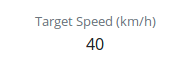
The label element requires the source property to get it’s data.
{
    "id": "l-timeGap",
    "type": "label",
    "title": "Timegap",
    "source": {
        "path": "/cloe/controllers/1/state",
        "name": "distance_algorithm"
    }
}
“led_label”
led_label is a variant of label. It’s speciality is that
it accepts only boolean values as input, so the source has to point
to a boolean value. It has an additional ‘LED light’ which indicates
the current value.
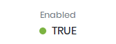
{
    "id": "l-enabled",
    "type": "led_label",
    "title": "Enabled",
    "source": {
        "path": "/cloe/controllers/1/state",
        "name": "enabled"
    }
}
“button”
The button element can be used to trigger one or more HMI buttons.

Button is primary an HMI input element, therefore it needs
an action property.
On the other hand it can also be used as an output. If a source is defined which points on a boolean value, the button will change it’s style depending on the source value. Therefore it needs parameters set for the default style (true) and the alternative style (false).
{
    "id": "bt-resume",
    "type": "button",
    "title": "Resume",
    "action": { "resume": "$STATE" },
    "source": { "path": "/cloe/controllers/1/state", "name": "active" },
    "params": {
        "default_style": "outline-success",
        "alt_style": "danger"
    }
}
“switch”
The switch is an input/output element. It’s appearance represents a boolean value and a click on it will trigger the HMI.
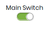
Therefore the element needs the source and action properties to be set.
{
    "id": "sw-main",
    "type": "switch",
    "title": "Main Switch",
    "action": {
        "enable": "$STATE"
    },
    "source": {
        "endpoint": "/$CONTROLLER/state/hmi",
        "path": "main"
    },
    "params": {
        "fitted_width": true
    }
}
“slider”
The slider is an input/output element. It’s appearance represents a numerical value and changing it’s position will trigger the hmi accordingly.
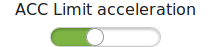
Therefore the element needs the source and action properties to be set.
{
    "id": "sl-acc-limit-acceleration",
    "type": "slider",
    "target": {
        "endpoint": "/$CONTROLLER/configuration/acc",
        "path": "limit_acceleration"
    },
    "source": {
        "endpoint": "/$CONTROLLER/configuration",
        "path": "acc.limit_acceleration"
    },
    "title": "ACC Acceleration Limit",
    "params": {
        "fitted_width": true,
        "minValue": 0,
        "maxValue": 50,
        "stepWidth": 0.5
    }
}
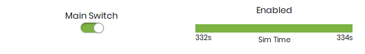
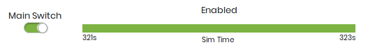
“timebar”
A timebar element is an indicator for the changes of a boolean value over the simulation time. In this example, the timebar shows that the controller was disabled at the start of the simulation and got enabled after a few seconds.
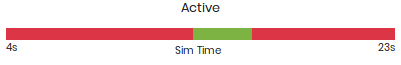
The timebar element requires the source property to be set and pointing to
a boolean value.
The colors of the timebar and the Label on the x-axis can be set with
the params property.
{
    "id": "tb-enabled",
    "title": "Enabled",
    "type": "timebar",
    "source": { "name": "enabled" },
    "params": {
        "x_label": "Sim Time",
        "color_true": "green",
        "color_false": "red"
    }
}
“linechart”
The linechart takes a numeric value and renders a simple chart with the simulation time on the x-axis and the numeric value on the y-axis.
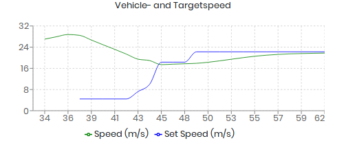
The linechart element requires the “source” property do be set with a single source object or an array of source objects. If an array of multiple source objects is specified, the element will render a line for each source. All sources have to point to numeric values.
As parameters the linechart element will accept a color for the line or an array of colors in case that multiple sources are defined.
{
    "id": "lc-vehicle",
    "title": "Achievable Realtime Factor",
    "type": "linechart",
    "source": [
        {
            "path": "/cloe/simulation/state",
            "name": "achievable_realtime_factor"
        },
        {
            "path": "/cloe/simulation/state",
            "name": "speed"
        }
    ],
    "params": {
        "colors": ["black", "#8884d7"]
    }
}
“layout”
With the layout object you can arrange the defined elements. There are two properties:
“type”
Currently the only supported layout type is grid.
“groups”
The groups property is a representation of the grid layout.
For each element group you have to specify an object with the
four properties, name, visibility_toggle, columns and elements.
The name property definies a string which will be displayed at top of the
group.
The visibility_toggle property is a boolean value which indicates the
initial visibility of the component. The default value is true.
The columns property defines how many elements a row in the grid will
include, the elements property is an array with element id’s.
{
    "layout": {
        "type": "grid",
        "groups": [
            {
                "columns": 2,
                "elements": ["sw-main", "tb-enabled"],
                "name": "Main",
                "visibility_toggle": false
            },
            {
                "columns": 2,
                "elements": ["l-any-active", "tb-active"],
                "name": "Active"
            },
            {
                "columns": 3,
                "elements": ["bt-resume", "bt-cancel", "bt-plus-minus"]
            },
            {
                "columns": 3,
                "elements": [
                    "bt-minus",
                    "l-fct-set-speed",
                    "bt-plus",
                    "bt-timegap-minus",
                    "l-fct-timegap",
                    "bt-timegap-plus"
                ]
            }
        ]
    }
}
Full Example
UI

Specification
{
    "controller": {
        "action": "$CONTROLLER/hmi",
        "title": "Basic Controller",
        "paths": {
            "source": "/$CONTROLLER/state"
        },
        "elements": [
            {
                "id": "sw-power",
                "title": "ACC",
                "type": "switch",
                "action": {
                    "enable": "$STATE"
                },
                "source": {
                    "endpoint": "/$CONTROLLER/state",
                    "path": "enabled"
                },
                "params": {
                    "fitted_width": true
                }
            },
            {
                "id": "l-active",
                "type": "led_label",
                "source": {
                    "path": "active"
                },
                "title": "Active",
                "params": {
                    "fitted_width": true
                }
            },
            {
                "id": "l-targetspeed",
                "type": "label",
                "source": {
                    "endpoint": "/$CONTROLLER/state",
                    "path": "target_speed"
                },
                "title": "Target Speed (km/h)"
            },
            {
                "id": "l-timegap",
                "type": "label",
                "source": {
                    "endpoint": "/$CONTROLLER/state",
                    "path": "distance_algorithm"
                },
                "title": "Timegap",
                "params": {
                    "fitted_width": true
                }
            },
            {
                "id": "sw-lka",
                "title": "LKA",
                "type": "switch",
                "action": {
                    "lka": "$STATE"
                },
                "source": {
                    "endpoint": "/$CONTROLLER/hmi",
                    "path": "lka"
                },
                "params": {
                    "fitted_width": true
                }
            },
            {
                "id": "bt-resume",
                "type": "button",
                "title": "Resume",
                "action": {
                    "resume": "$STATE"
                },
                "params": {
                    "default_style": "success"
                }
            },
            {
                "id": "bt-cancel",
                "type": "button",
                "title": "Cancel",
                "action": {
                    "cancel": "$STATE"
                },
                "params": {
                    "default_style": "danger"
                }
            },
            {
                "id": "bt-plus",
                "type": "button",
                "title": "+",
                "action": {
                    "plus": "$STATE"
                },
                "params": {
                    "default_style": "info"
                }
            },
            {
                "id": "bt-minus",
                "type": "button",
                "title": "-",
                "action": {
                    "minus": "$STATE"
                },
                "params": {
                    "default_style": "info"
                }
            },
            {
                "id": "bt-timegap",
                "type": "button",
                "title": "Change Timegap",
                "action": {
                    "distance": "$STATE"
                },
                "params": {
                    "default_style": "info",
                    "fitted_width": true
                }
            },
            {
                "id": "tb-active",
                "title": "Active",
                "type": "timebar",
                "source": {
                    "path": "active"
                },
                "params": {
                    "x_label": "Sim Time",
                    "color_true": "#7cb342",
                    "color_false": "#dc3545"
                }
            },
            {
                "id": "tb-enabled",
                "type": "timebar",
                "source": {
                    "path": "enabled"
                },
                "params": {
                    "x_label": "Sim Time",
                    "color_true": "#7cb342",
                    "color_false": "#dc3545"
                }
            },
            {
                "id": "tb-lka",
                "type": "timebar",
                "source": {
                    "endpoint": "/$CONTROLLER/configuration",
                    "path": "$.lka.enabled"
                },
                "params": {
                    "x_label": "Sim Time",
                    "color_true": "#7cb342",
                    "color_false": "#dc3545"
                }
            },
            {
                "id": "lc-vehicle",
                "title": "Vehicle- and Target-Speed (m/s)",
                "type": "linechart",
                "source": [
                    {
                        "endpoint": "/$CONTROLLER/vehicle",
                        "path": "$.components['cloe::default_ego_sensor'].sensed_state.velocity_norm",
                        "name": "Speed (km/h)",
                        "math": "x * ((60 * 60) / 1000)"
                    },
                    {
                        "path": "$.target_speed_mps",
                        "name": "Target Speed (km/h)",
                        "math": "x * ((60 * 60) / 1000)"
                    }
                ],
                "params": {
                    "colors": ["black", "#8884d7"]
                }
            }
        ],
        "layout": {
            "type": "grid",
            "groups": [
                {
                    "columns": 2,
                    "elements": ["sw-power", "tb-enabled"]
                },
                {
                    "columns": 2,
                    "elements": ["sw-lka", "tb-lka"]
                },
                {
                    "columns": 2,
                    "elements": [
                        "l-active",
                        "tb-active",
                        "bt-resume",
                        "bt-cancel"
                    ]
                },
                {
                    "columns": 3,
                    "elements": ["bt-minus", "l-targetspeed", "bt-plus"]
                },
                {
                    "columns": 2,
                    "elements": ["bt-timegap", "l-timegap"]
                },

                {
                    "columns": 1,
                    "elements": ["lc-vehicle"]
                }
            ]
        }
    }
}