Add a new Element type to the dynamic Controller
The dynamic controller component (DCC) supports different element types,
like button, linechart and switch.
In this example we will add the new element type label to this list.
This simple element will display a single labeled information like this:
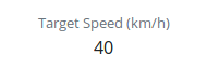
So beside an id and the type, we need to pass a title and a source for the value via the DCC JSON specification:
{
    "id": "l-targetspeed",
    "type": "label",
    "title": "Target Speed (km/h)",
    "source": {
        "endpoint": "/$CONTROLLER/state",
        "path": "target_speed"
    }
}
If Cloe UI loads this specification, it will raise an error because the type
label is unknown yet. So let’s implement it!
Preparation
The prerequisite for a new element type is that a corresponding react component exists. It is possible to define everything directly in the DCC, but in terms of reusability and being ‘React-ish’, you should define it as an individual component.
So we define a new react component named Label in a new file
src/components/label.jsx :
 1// The Label component represents one single key-value pair.
 2// It displays a value with it's key (label).
 3
 4import React from "react";
 5
 6function Label(props) {
 7    const { label, value } = props;
 8    return (
 9        <div className="container">
10            <div className="row">
11                <div className="col-sm">
12                    <small className="font-weight-light text-secondary">
13                        {label}
14                    </small>
15                </div>
16            </div>
17            <div className="row">
18                <div className="col-sm">
19                    <span>
20                        {value}
21                    </span>
22                </div>
23            </div>
24        </div>
25    );
26}
27
28export default Label;
Our component takes two props, label and value (line 7) and
displays them in a bootstrap grid.
Implementation in DCC
Now that the component is defined by itself, we can use it in the DCC.
The DCC is defined as a react class component called Controller in
src/components/controller.jsx.
The first step is to import our Label component outside of the
Controller class:
import Label from "./label";
For each element type, the class has a method which takes the specified
information (in our case mainly the title and source), and pass them over
to the right Component. This methods name’s are prefixed with generate,
e.g. the method to generate a button is named generateButton.
So as second step, we add a new method generateLabel to the
Controller class, which takes a labelElement as argument:
generateLabel = (labelElement) => {};
The labelElement will be an object which includes all relevant information
which is needed to render it. It’s basic structure is similar to it’s JSON
specification. The only differences are in the sources property
and the new reactElement property. It looks like this:
 1{
 2    "id": "l-targetspeed",
 3    "title": "Target Speed (km/h)",
 4    "type": "label"
 5    "sources": [{
 6        "endpoint": "/$CONTROLLER/state",
 7        "path": "target_speed",
 8        "math": undefined,
 9        "name": undefined
10    }]
11    "reactElement": undefined
12}
The yet undefined reactElement is what is needed by Cloe UI to render
something. We will generate it with our generateLabel method.
So we need to pass the label and the correseponding value to the
Label component.
The label is easy, we will take the labelElement.title property.
To get the value, we use a method called _genSourceValue(source).
Since labelElement.sources is of type array, we need to pass
labelElement.sources[0] as argument:
1generateLabel = (labelElement) => {
2    const value = this._getSourceValue(labelElement.sources[0]);
3    const title = labelElement.title;
4};
Now we can use our Label component, pass all needed information and
store it in labelElement.reactElement and return the updated element:
 1generateLabel = (labelElement) => {
 2    const value = this._getSourceValue(labelElement.sources[0]);
 3    const title = labelElement.title;
 4
 5    labelElement.reactElement = (
 6        <Label
 7            key={labelElement.id}
 8            label={title}
 9            value={value}/>
10    );
11    return labelElement;
12};
Note
Make sure to specify a unique key prop. This is needed by react in order to differ between elements based on the same component. the element’s id should be fine in most of the cases.
The third and final step is to make sure that Controller identifies
the new element type and execute the generateLabel method if needed.
The generate methods are executed from within the generateJSX method.
It iterates through all specified elements, identifies their types and executes
the respective generate method. This logic is implemented as an switch-case
construct.
We simply have to expand it with our new type and its generator method:
 1generateJSX = () => {
 2    for (let index in this.elements) {
 3        switch (this.elements[index].type) {
 4            case "button":
 5                this.elements[index] = this.generateButton(this.elements[index]);
 6                break;
 7            case "switch":
 8                this.elements[index] = this.generateSwitch(this.elements[index]);
 9                break;
10            case "label":
11                this.elements[index] = this.generateLabel(this.elements[index]);
12                break;
13            default:
14                break
15        }
16    }
17};